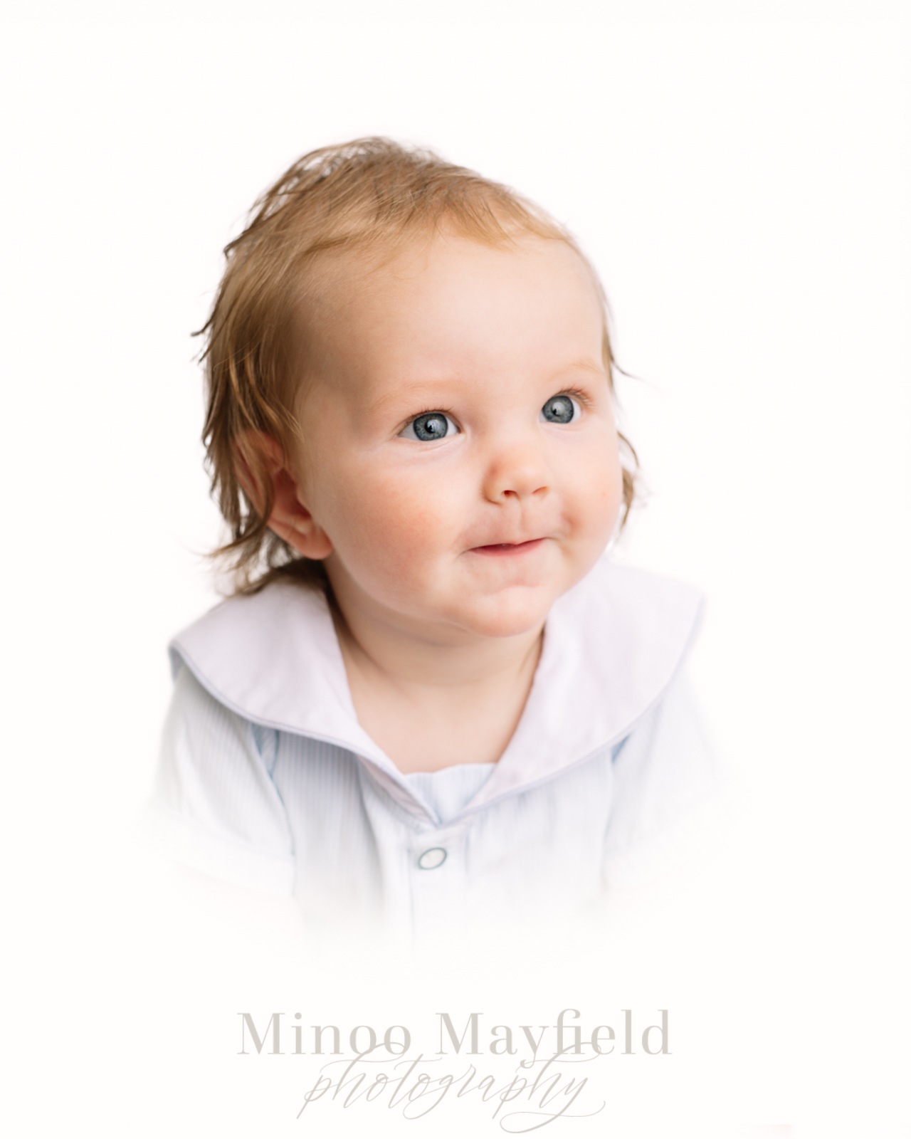
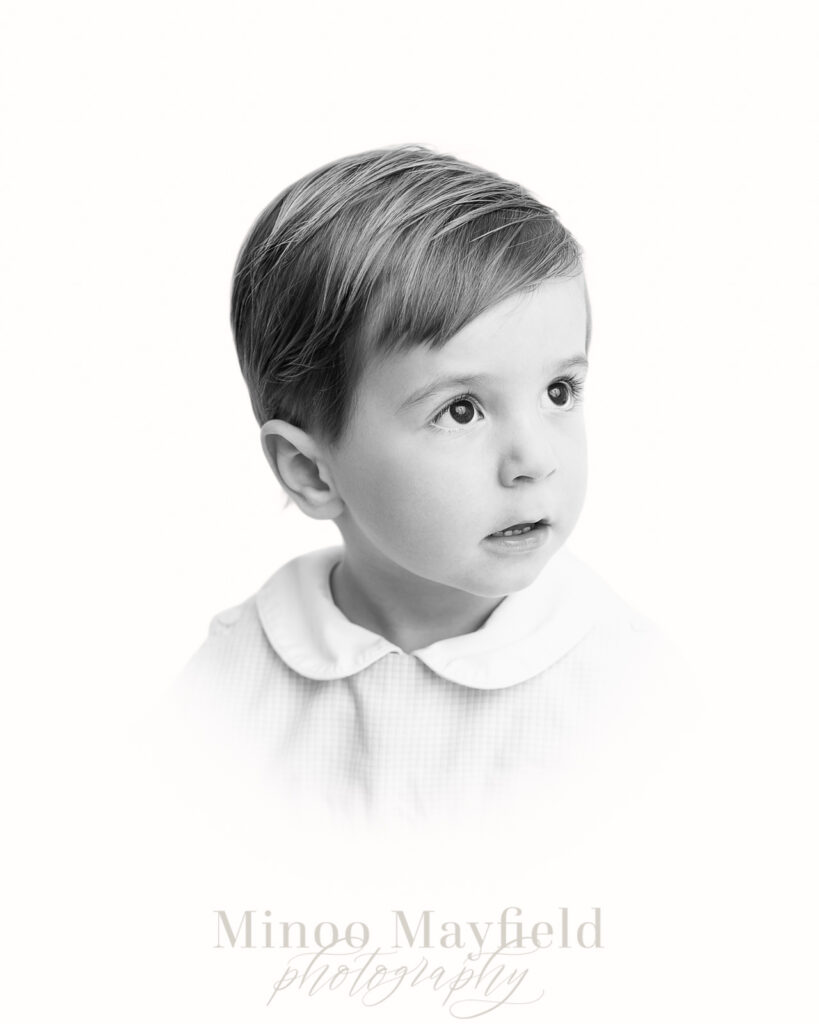
Want to Improve Your Heirloom Portraits?
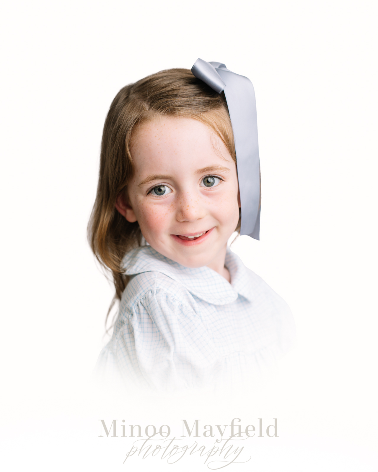
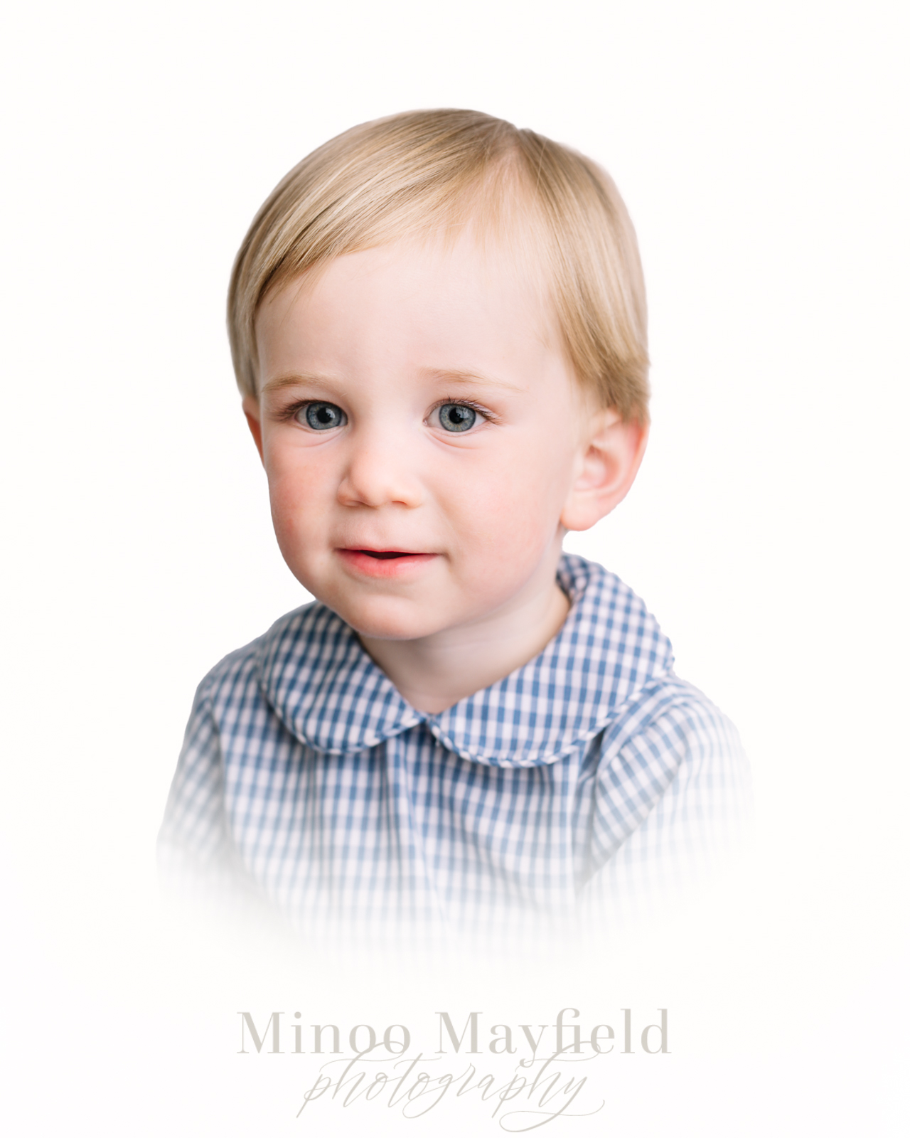
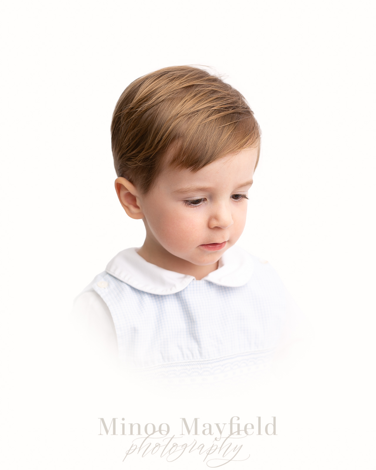
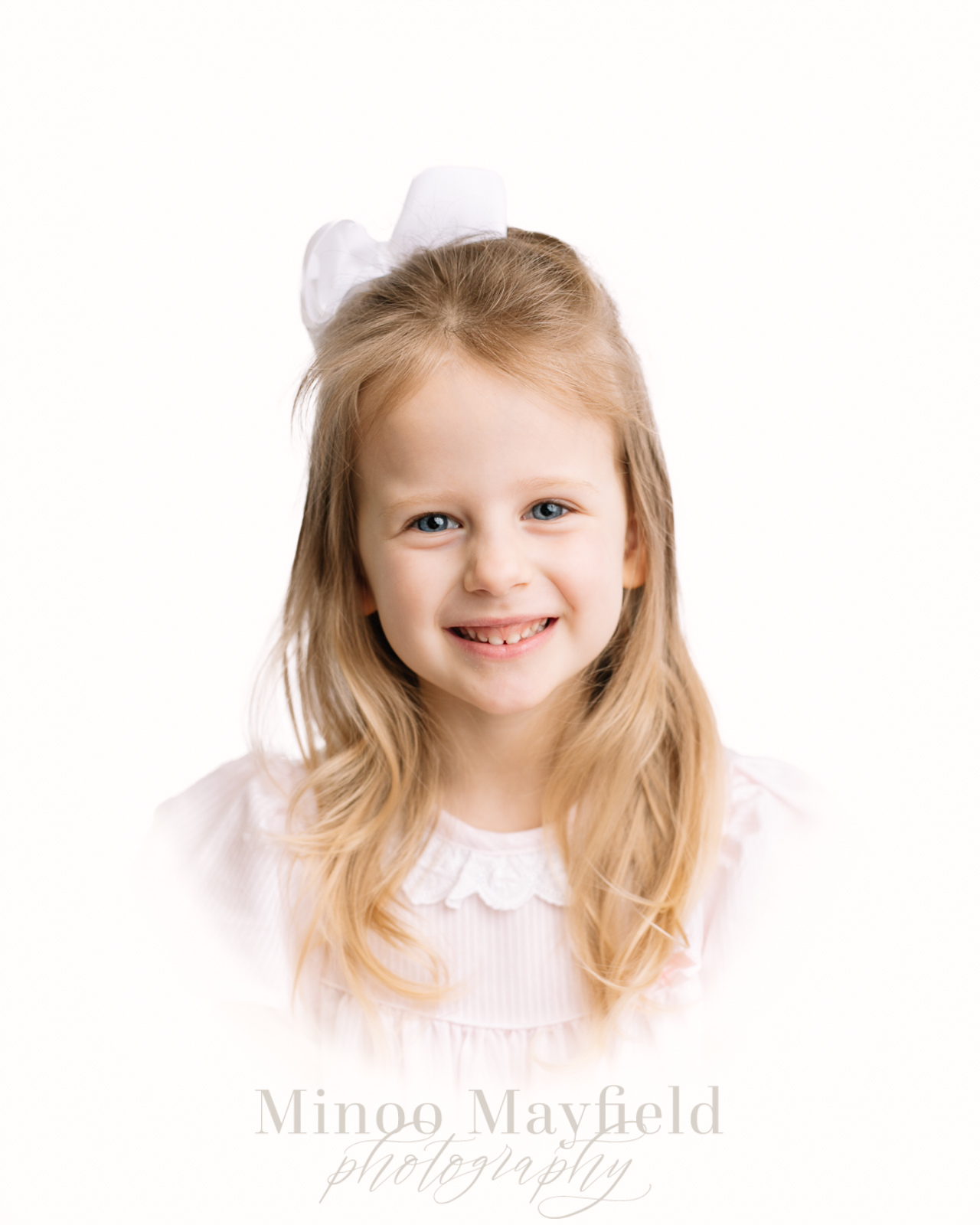
Heirloom portraits are a stunning display of a timeless photography style reinvented for the modern area. If you have searched through multiple portfolios of heirloom portrait photographers, you’ll quickly find that there are multiple lighting and editing styles. In my personal and professional opinion, I believe there is a certain style that appears far superior than others. That style? Omitting the obvious Lightroom vingette that cheapens the overall style and, instead, creating a seamless line between background and vingette.
1. Lighting with Strobe
A portfolio will speak for itself if the lighting is consistent. Consistency convinces a perspective client that you have your editing process nailed down and they can imagine the results of their final gallery. Lighting is tricky. It can even sometimes be a beast. A really ugly beast that can result in undesired differences in white balance, shadows and highlights if you don’t know what you’re doing.
From my personal experience, relying on natural light for heirloom portraits makes me nervous to charge a premium rate. How can I guarantee exceptional quality if I’m relying on the weather that seems to never behave how I want it to? My tip – learn rembrandt lighting with strobe, aka use a single lighting source at a 45 degree angle from your subject to recreate natural light. Not all artifical lighting is flashy. You can really make it beautiful and demure! Some brands to consider for a strobe light would be Westcott and Godox. If you aren’t familiar with using artificial lighting to enhance your heirloom portraits, I strongly suggest taking an online course!
2. Subject Placement
To state the obvious – don’t be right up in their face. An heirloom portrait can quickly turn jarring if your subject’s face takes up more room than the negative space (aka vingette) surrounding them. I shoot with a 50 mm prime lens (it never leaves my camera, honestly), and I stay at my subject’s level about 4-5 feet away. Having your subject in the same chair, placed in the same spot, with you in the same spot, will speed up your editing time! Encourage your subject to angle their body in different direction to ensure variation in your client’s final gallery, but try your best to keep placement the same.
3. Editing Heirloom Portraits in Photoshop
If you’re relying on Lightroom solely, it is time to introduce Photoshop to your heirloom portrait editing workflow. There are various techniques within Photoshop (that one can find on Youtube!) to create a seamless background behind your subject so that the only line you see in the vingette is the bottom half. I’d suggest using a soft brush to create the “vingette” line because a harsh line will come across very stark. Been there. Done that. Redited those images. Also, think about the color you want your background to be. Do you like a pure white (hex #FFFFFF), warmer white or even a cool grey? Whatever color suits your style best, use that same color for every image you edit.
Wrapping It Up
If you find that you are still trying to find the best editing workflow for you, then I hope you find these tips to be helpful! Please know I am writing from my own experience of what was benficial in my journey. I took a class on strobe lighting, I photographed heirlooms while taking multiple mental notes (that turned into pen and paper notes), and I studied Photoshop/did several rounds of editing before feeling confident in my heirloom portrait style. As with anything, practice, albiet grueling at times, is beneficial!
